Hi everyone! In light of the recent rollercoaster in assets prices, I’d like to share the outlook on what has been a solid “safe heaven” these days.
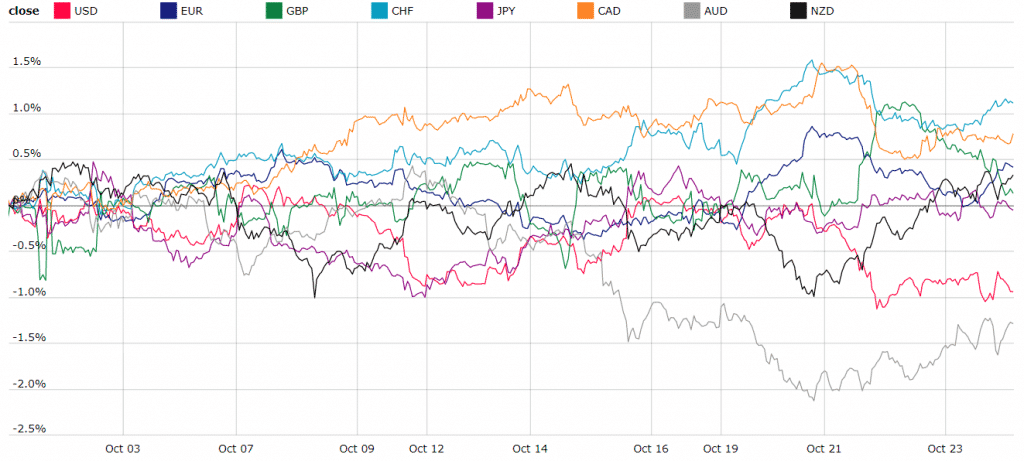
Below you see the chart of the currency index that shows the change in one currency relative to other major currencies. Notice the light blue line, which is Swiss Franc (CHF). Since the beginning of October, it has been holding above almost all other currencies, competing only with the Canadian dollar (CAD), which is usually highly dependent on oil prices. This chart tells us than in general CHF has been relatively strong compared to other majors during October.
Getting down to the FX charts – the obvious one
As CHF has been the strongest currency, let’s check the first pair that comes to mind to get exposure to CHF – USDCHF.
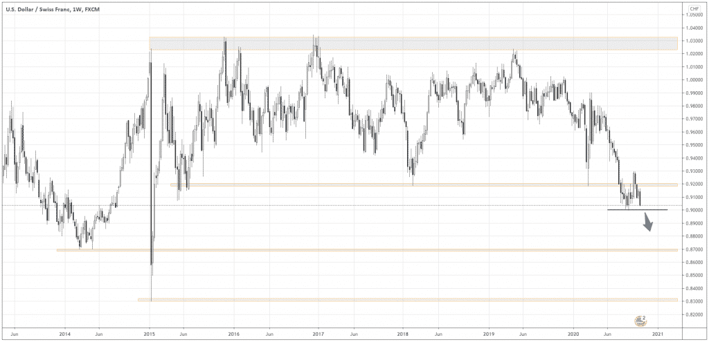
In the chart above, you can see the long-term channel that has been formed for five years in the range between 0.92 and 1.03 (grey areas).
At the end of July, the market finally has broken out from the channel, going below 0.92 and retesting the down border of the channel, which now became a mirror price level.
Now, we see a huge potential for a move down to the nearest meaningful supports at 0.87 and 0.83.
The last confirmation of the proceeding move would be the breaking of the local low at 0.90 (black line). For those seeking to trade the momentum, I’d wait until a black, preferably a full-body candle is formed with the close below 0.90. The minimum protective stop loss should be above 0.90.
In case of a rut to safe-havens
I believe one of the best trade opportunities will come up if the global sentiment changes to risk aversion. That means investors would be more likely to sell “high-yielding” currencies, such as AUD and NZD and buy something they consider a “safe” asset.
Looking at the currency index above, I’m reluctantly calling USD and JPY the best choices for safe-havens, as they are considered so traditionally. CHF looks more attractive, based on its recent relative strength.
Looking for the weakest prey
I like buying the strongest and selling the weakest. You already got the idea about the strongest. How about the weakest in case of the risk aversion sentiment?
Let’s analyze our first candidates to short from the majors – AUD and NZD. Which one is weaker? Look at the AUDNZD chart below.
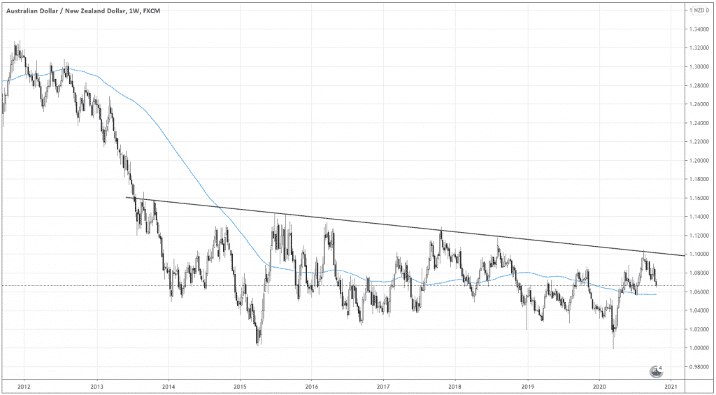
Here is the epic range that’s been forming for the last five years. The blue line is the Moving Average (100). I see this MA as the mean of the range.
Currently, the pair is in the upper part of the range, suggesting a possible return to the mean or further below the mean. That gives us a short-term bias to be bearish on AUD.
Do you want some long-term bias? Look at the slope of the channel! Unless it’s broken out above the upper border (the inclined black line), the odds are AUD will be weaker over time.
Final confirmation of the weakness
To make sure about the relative weakness of AUD, let’s compare AUDCHF and NZDCHF (see the charts below).
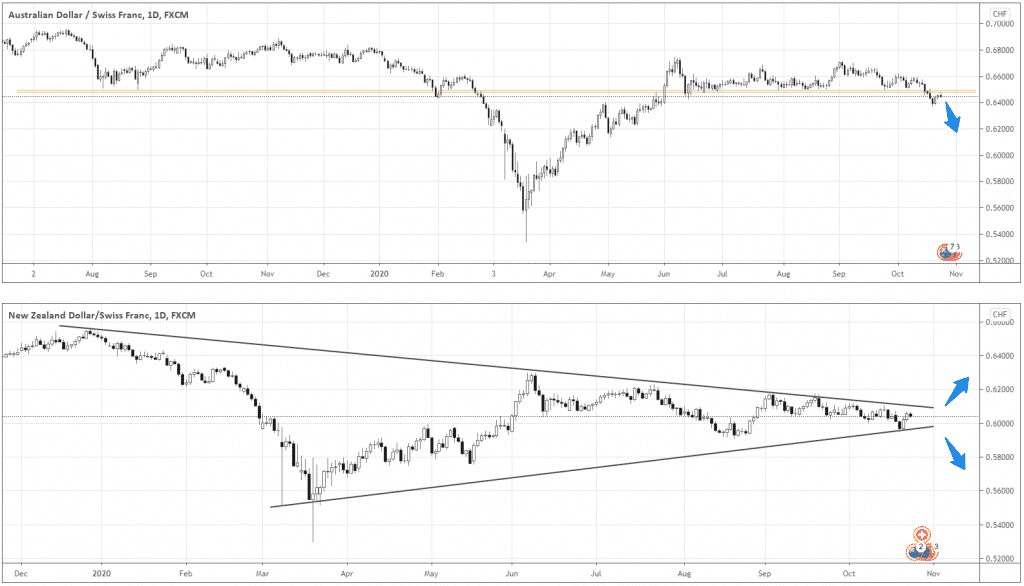
AUDCHF looks more like one-directional setup, as it broke the support around 0.65 and is currently testing it from below.
On the contrary, NZDCHF forms a symmetrical triangle, which implies the possibility to move in either direction.
Question: what sounds more definite, “probably down” or “up or down”?
Concluding
The relative strength of CHF offers excellent trading opportunities in a wide range of currencies. USDCHF is already actual, while AUD and NZD will activate along with the shifts in global sentiment towards risk aversion.
