The broad markets are in a correction phase, and it’s still due to figure out whether we’re preparing for the new dive into the risk-seeking mood or the “correction” would develop into something worse… During such times it’s so refreshing to find something that goes against the grain. Here is your refreshment – today, we’re talking relative strength and the epic breakout in Japanese Index Nikkei! Let’s dive right into it by looking at the monthly chart of Nikkei below.
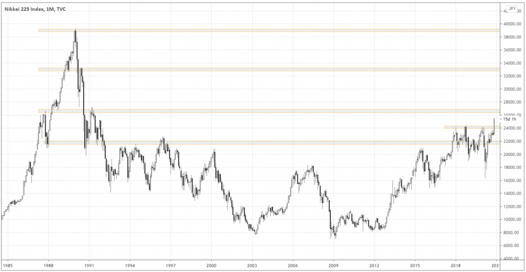
As you can see, the Japanese stock market has never recovered since the market top at the beginning of 1990. Since then, for nearly thirty years, the market has been in a wide range.
Although we’re still in the middle of November, the current monthly candle is vividly bullish, screaming about the breakout and likely the proceeding uptrend.
After such a long-range or accumulation phase, it would not be surprising if the market eventually goes all the way to all-time highs.
How do you manage the trade?
Below is the weekly chart of Nikkei. The last weekly candle confidently closed above the range.
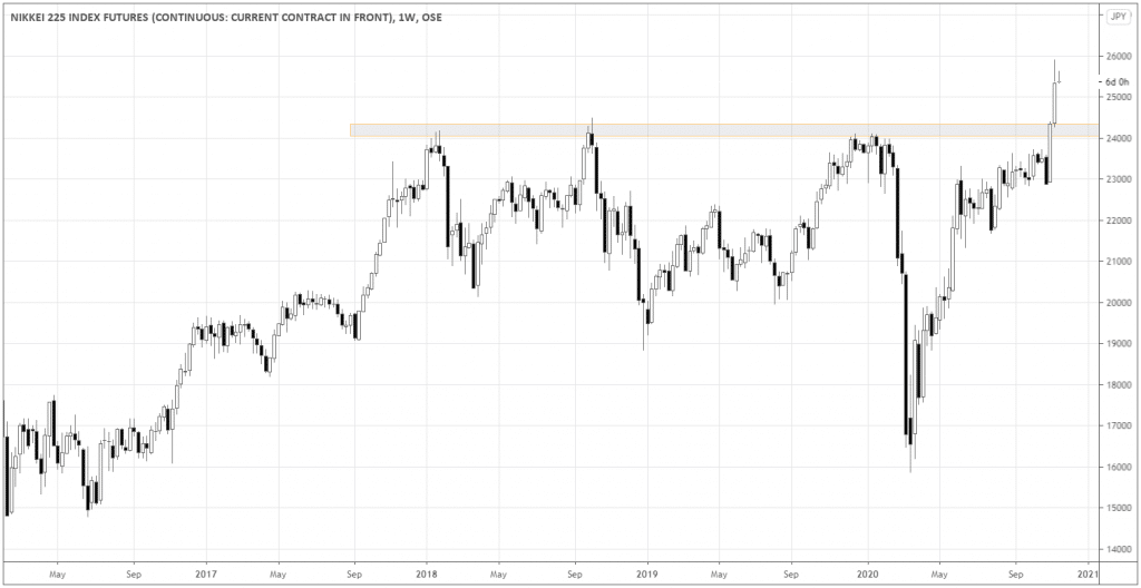
The best protective stop would be anywhere below the broken resistance (the grey area), so below 24000 would be a safe bet. The more aggressive stop would be right below the last weekly candle’s low.
What kind of move potential to expect? The monthly chart tells us that a good target would be somewhere around 33000. So, we expect a minimum of 1:5 risk/reward ratio on this long-term trade. Sounds crazy? Not really, considering the length of the sideways phase of this market.
There are also eye-catching pieces of evidence looking at this setup from other perspectives.
Relative strength divergence
I like taking the momentum of the S&P 500 as a benchmark and compare it with my target world stock indices. Below, you can see the chart of Nikkei225 versus the S&P 500. I also used the RSI indicator to spot the long-term divergence between the indices.
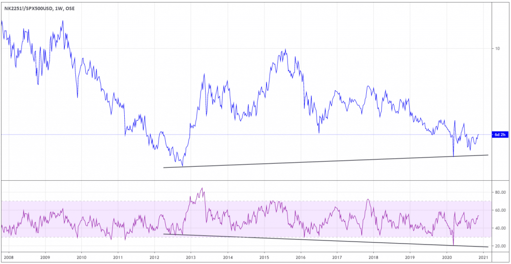
On the chart of the Nikkei225/S&P 500 ratio, the bottom of the crash in March couldn’t go below the low of the year 2012. At the same time, RSI showed the lower low (marked with the inclined trendlines), signifying the divergence in the global momentum.
The signs from the COT report
Let’s look at what Commitment of Traders can tell us on the Weekly chart of Nikkei. I circled all of the points when the two groups of the biggest players of the futures market had an equal number of open interest or outstanding contracts. It happens when the green line (commercial hedgers) crosses the red line (Large traders).
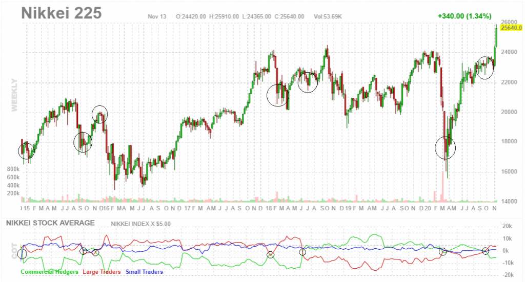
You can see that each time such crossover serves as an inflection point, which precedes the significant move. It doesn’t
look like we’re going down after the last one!
Summing up
The recent breakout of the Nikkei225 index offers excellent opportunities to participate in the possible strong bullish trend weeks ahead. Digging deeper, we can find the confirmation of the hidden strength of the Japanese stock market in the momentum divergence with the S&P500 and the signal from COT reports.

